“To the extent that interest rates do move up in the future means broads sets of asset classes are going to see big movements downward based up standard arbitrage type relationships.”
-JOHN WILLIAMS, President of the Federal Reserve Bank of San Francisco
Let’s get ready to rumble! This month’s Gavekal EVA is a body slam worthy of World Wrestling Entertainment (WWE), at least for those who expect the investment status quo to continue being so. What’s particularly noteworthy is, as you will read, this article was written before the market suddenly did a face-plant early last month (a pratfall it is reprising in recent days).
To be fair, as you will also see, my partners Louis and Charles Gave did not predict trouble in the immediate vicinity when they published their paper. However, they did nail the culprit: that long-comatose economic and market scourge called inflation. Shortly after its release, inflation worries pushed the 10-year T-note yield close to 3% which, in turn, hammered stocks in early February. The question on almost everyone’s mind now is whether that was just a random tremor or the presaging of a much more serious quake.
Because this Gavekal piece is on the longer side, I will keep my intro as skinny as possible. The main point I would like to convey is that if Louis and Charles are right, and we are moving into a more inflationary phase, the investment implications are—to use a highly technical term that I sparingly employ—ginormous.
For one thing, as they describe, rising inflation consistently leads to falling price-earnings (P/E) ratios. As all but the most starry-eyed optimists realize, P/Es are presently extremely generous, particularly using current earnings as opposed to the celestial estimates being pushed by the dream factory known as Wall Street. (I mean, really: profits rising from $125 for the S&P in 2017 to $173 by 2019, at this elderly stage of the expansion? The tax cut is probably about $10 of that $48 increase but the rest looks dreamy indeed.)
Another huge consequence, if they are right, is that bonds will no longer provide an offset to stocks. For most of the last 30 years, when stocks got hit, bonds rallied, providing a nice cushion for balanced investors who had 30% or more of their portfolios in high-grade bonds. Instead, should inflation truly do even a faint flashback to the ‘70s, they are likely to go down together. Perhaps it’s just a fluke but this is exactly what we saw for a time in the first half of February. With untold tens of billions dedicated to risk parity strategies—where highly leveraged bond positions are blended with stocks on the theory they move in opposite directions—this is the ultimate nightmare scenario.
Leaving that esoteric strategy aside, even “plain vanilla” investors would find it highly discomforting to be simultaneously losing money on both ends of their portfolios for any extended timeframe. Consequently, investors who feel they need a counter-balance to their equity exposure—which, in my mind, should be almost everyone—may be forced to come up with alternative asset classes. As Louis and Charles note, gold and cash fit the bill, particularly if inflation is readying to rock and roll. (In recent months, to protect the income-oriented side of our clients’ portfolios, Evergreen has been shifting into high-grade floating rate corporate debt, as well as short-term treasuries, and last week’s EVA made the case for gold exposure.)
As to whether the recent sudden market downdraft was a fake worthy of the WWE or the rumblings of a far more dangerous confrontation, inflation could be the key factor. The reality is, investors love asset inflation but if we are on the verge of the real deal, that’s a very different story—and one with a much less happy ending.

David Hay
Chief Investment Officer
To contact Dave, email:
dhay@evergreengavekal.com
A “ONCE IN A GENERATION” SHIFT
By Charles Gave and Louis-Vincent Gave
Today’s relentless bull market in everything rests partly on two pillars:
Independently, these two notions make sense. But they do not add up when taken together or viewed over any sustained period of time. If the premise of #1 is that firms use big data and smart management to “right size” their production, how does the #2 idea of “constant overcapacity” and depressed prices make sense? Such apparent dissonance assumes that half the world’s firms are getting smarter—right-sizing their balance sheets and optimizing production—while the rest are as dumb as ever by adding capacity at the wrong point of the business cycle (for others to exploit) and investing with scant regard for future returns.
In recent years, a number of clients have made this point to us. Why, they say, bother investing in Asia, where companies are often run by knuckle-headed management teams that over-invest in the hope of building an empire. The alternative is to invest in the US, where corporate managements aim to right-size the business and maximize profits.
We are sympathetic to this view, for it was pretty much the thesis of our first Gavekal book, Our Brave New World. However, in recent months we have started to wonder if this framework is now breaking down. For anyone who has to manage a portfolio, the significance of this (potential) macro shift could end up being enormous.
Why we are getting uncomfortable: the theory
Since our default position over the years has been to downplay risks emanating from China, we have been variously labelled China perma-bulls or even apologists. Now, given that the last two bouts of synchronized global growth (2009-2010 and 2016-17) were first and foremost engineered by Chinese stimulus and rebounds in Chinese domestic growth, this position has so far served us decently well.
And behind our almost constant bullishness on Chinese growth has sat a simple premise, first brought to our attention by Charlie Munger; namely, “show me the incentives, and I’ll tell you the outcome”.
Indeed, throughout both our careers, the incentives facing the typical Chinese Communist Party cadre were simple: “Generate high growth in your province/county/district/town and you too can aspire to climb the CCP’s greasy pole. In fact, generate enough growth in different jobs and one day you may say goodbye to the boonies and make your way back to Beijing”.
Given these incentives (and having spent time in the Chinese countryside ourselves, we fully understand the urge to “move on” to the next job!), our default assumption has been that China could always be counted on to generate growth. Local building permits would be approved, as would plans for new factories, oil wells, steel mills or coal mines.
But did things recently change? At the 19th Party Congress in October, Xi Jinping made it clear that henceforth Party officials would not be judged on growth alone. Pollution control would be a factor, as would healthcare, education and the general population’s housing conditions.
Now imagine being, say, the mayor of Wuhan, or the governor of Anhui province and having just received your marching orders from Xi Jinping himself in the Great Hall of the People. Do you:
a) Go home and assume that Xi didn’t mean what he said and keep going as you did before?
b) Go home and tell your local power producers “no more coal, just burn gas” and tell your local steel mill “you are shut down” and your local property developer “I’ll give you this permit, but you first need to increase production of social housing”?
If you have made it this high in the party hierarchy and survived Xi’s purge, it’s probably safe to assume that you have a disposition towards not questioning authority and an inclination to obey orders. Thus, option b seems most likely. And, sure enough, as the delegates to the CCP Congress started to head home, the first thing we witnessed was a rapid doubling of natural gas prices, while steel output rolled over.
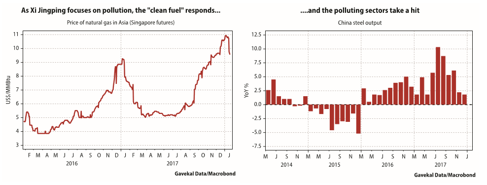
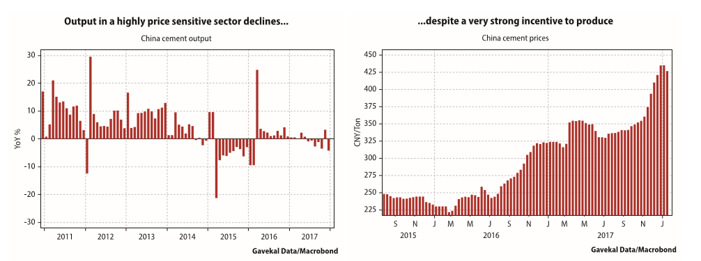
In the same period, output from the highly polluting cement industry also rolled over into negative annual growth. The really interesting thing is that this shift in output occurred despite cement prices having shot up.
So, is this a case of “show me the (new) incentives, and I’ll tell you the (different) outcome”?
For years, the incentive structure in China almost guaranteed overcapacity in pretty much everything. Then China would export this overcapacity, earn US dollars and re-invest the dollars into treasuries and so keep US (and global) interest rates low. More than a decade ago we dubbed this a “circle of manipulation” but is the characterization still apt? For starters, China is clearly no longer keen to re-invest excess dollars into treasuries, but is instead trying to make the renminbi a trade and reserve currency.
And, for seconds, it seems that the incentive structure in China may be shifting, so that too much output does not automatically get produced. Take the above example of cement. The rising price should have led to higher production (more demand triggering a supply response). Yet, in a clear break from previous historical precedents, China’s cement production is not responding to the signal of higher prices.
Why we are getting uncomfortable: the practice
Baseball sage Yogi Berra once said “In theory, there is no difference between theory and practice. But in practice, there is.” With this in mind, the following makes us uncomfortable “in practice”. The first is that as oil prices spike higher, the likes of Japan, Korea and China (all big oil importers) are generating impressive equity performance. It is unusual, if not unprecedented, for these three markets to rise in unison. What characterizes China, Japan and Korea is that they have been the ones who have generally piled on extra capacity, regardless of that capacity’s return. Put another way, these three countries account for the apparent contradiction reviewed in our introduction lasting for so long.
Yet, we also know that China has in recent years embarked on “supply-side reform” (in China, this actually means supplying less rather than a Thatcherite reduction in government meddling!), Japanese corporates have become marginally more efficient capital allocators, and the Korean won has appreciated such that its competitiveness must be questioned.
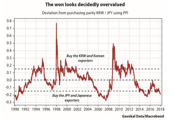
So, let’s imagine that China (supply-side reforms and changed incentive structure), Korea (overvalued won) and Japan (finally looking out for shareholders) are no longer adding capacity hand over fist. Hence, if Northeast Asia isn’t adding capacity, who is? It isn’t the US, where corporates are busy buying back their shares, while private equity and venture capital firms scramble to fund the next “overcapacity-optimization” platform (Uber, Lyft, Airbnb…). It isn’t Europe either, where until recently, investment trends were rather pedestrian. So, if the conclusion is that no one is adding productive capacity, what should we expect?
A turn in the outlook for Northeast Asia
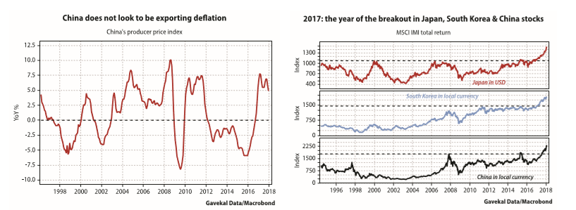
The first obvious consequence would be a rise in producer price inflation. Interestingly enough, this seems to be unfolding—at the very least, China, Japan and Korea have all stopped exporting deflation (see left hand chart below). Another potential consequence is that the guys who for years added excess capacity and reaped few rewards for their efforts, all of a sudden receive outsized returns as the capacity they do own gets bid up. Funnily enough, 2017 was the year when Chinese, Korean and Japanese equity markets all decisively “broke out” from long established trading ranges (see right hand chart below).
Perhaps we would be willing to discard all of the above as sheer noise if it wasn’t for one uncomfortable recent development, namely the growing dichotomy between a falling US dollar and rising treasury yields. Doesn’t this tell us that something doesn’t “smell right”? Rising yields and falling exchange rates are usually more the hallmarks of fragile emerging markets than the issuer of the world’s reserve currency.
The specter of inflation, and why inflation matters
Our more faithful (or older) readers will remember the diagram below, which Charles first published in 1978 during his Cecogest days.
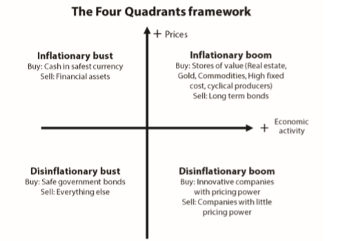
Back then the prices of the marbles Louis used to play with at school were rising rapidly and the aim of every economist was to figure out whether the coming year would bring an “inflationary boom”, or an “inflationary bust”. Yet the shift that ended up mattering for the next 30 years was not that from the left of the diagram to the right (these shifts tend to occur every five to seven years), but the move from the top of the diagram to the bottom (these seem to occur every 30 to 50 years).
These shifts from left to right (bust to boom) and from top to bottom (inflation to deflation) are illustrated in the chart below:
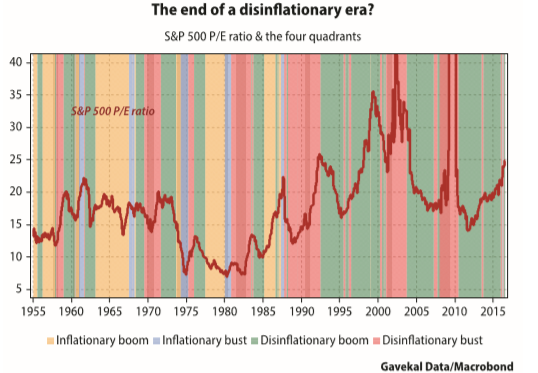
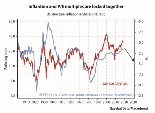
In the upper half of the diagram, asset classes behave very differently than in the bottom half of the diagram. For a start, inflation tends to be a slayer of multiples. The higher the inflation rate, the lower the market’s price/ earnings ratio.
The weight of inflation on equity valuations probably explains the legendary 1979 BusinessWeek cover on “The death of equities”.
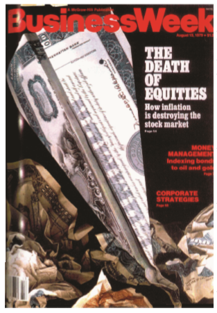
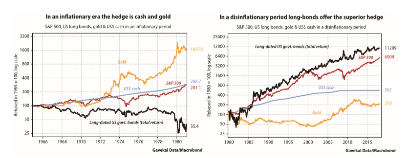
To be fair, equities over the previous 15 years, with dividends re-invested, had returned less than compounding cash (see left hand chart below). Though, at least, that was better than bonds. This situation would be turned on its head in the following decades as inflation made way for disinflation (see right hand chart below). In a disinflationary world, such as that of the last four decades, bonds and other fixed income instruments offer the natural hedge for equities. But in an inflationary environment, cushioning equity risk with fixed income does not work. Instead, the hedge becomes cash, or gold. Thus, readers who, like us, are starting to fret that the risk to the current disinflationary boom is not yet another deflationary bust, but instead a Lazarus-like revival of inflation, will need to start reviewing their entire portfolio construction process.
The portfolio construction process
We tend to think of “well-built” portfolios as being divided between three baskets:
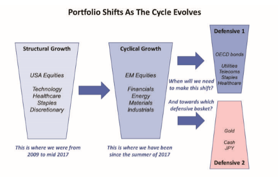
Investors who fear that the currently falling US dollar will break the back of the nascent European recovery (say, by pushing Italy back into recession), will tend to favor the dark blue “defensive basket #1” as a cushion against their current “cyclical basket”. Meanwhile, investors who fear that the recent pick-up in inflation is the start of a new trend, and who fear that oil prices will continue to rise until high energy costs break the back of the current recovery, may favor the pink “defensive basket #2”. So which to pick? And when should the shift from “cyclical growth” to “defensive basket #1” or “defensive basket #2” occur?
The answer to these questions may partly be provided by the markets themselves, specifically by the relative performance of gold to long-dated treasuries. Indeed, in a “disinflationary boom”, bonds would be expected to outperform gold (and so investors would continue to benefit from diversification). However, indications of a looming “inflationary boom” or “inflationary bust” would be flagged by bonds underperforming gold.
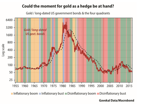
With that in mind, we seem to be approaching an important crossroads as the gold/bond ratio is hovering very close to its four-year moving average. And historically, the ratio has tended to be rather “trending”, meaning that after it broke through the four-year moving average it has tended to stay there for quite a while. Most importantly, these periods have tended to coincide with our inflationary/ deflationary boom/bust framework described above.
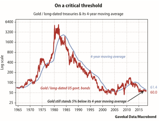
In short, we are on the threshold of a change-of-state, but have not moved across it. For now, our indicators still point towards a continuing deflationary boom. But given the proximity of the gold/bond ratio to its four-year moving average, it makes sense for investors to consider a “different” type of defensive basket from the one that has been commonly deployed for the last 30 or so years.
Conclusion
All prices are “equal” and all prices carry important information. Nonetheless, like the animals in George Orwell’s Animal Farm, some prices are more equal than others. Specifically, changes in oil prices, or US interest rates, and changes in the value of the US dollar tend to cast a long shadow.
A couple of years ago oil was tanking, US interest rates were on the floor and the dollar was surging. Fast forward to 2018 and this situation has fully reversed: oil prices and US interest rates are both rising while the dollar is weakening. Clearly, the investment landscape has changed and, at the very least, a shift in the relative performance of sectors, markets, and asset classes should be expected. Any student of the markets know that rising interest rates and oil prices will, over time, suck the fun out of any equity bull market. The only question is how long this takes. With that in mind, what should investors fear most today?
Nonetheless, we do note that the air seems to be coming out of the crypto -currency speculative bubble, the world’s “safe-harbor” currencies (yen and Swiss franc) have been bid up and gold and gold miners have stopped underperforming. To be sure, this does not validate a full-blown change in the investment environment and abandonment of the “cyclical growth” basket. But it may be time to start building a “defensive basket” and more importantly to think hard about the key risk that one is seeking to hedge: rising inflation, or falling growth?
OUR CURRENT LIKES AND DISLIKES
No changes this week.
LIKE
NEUTRAL
DISLIKE
DISCLOSURE: This material has been prepared or is distributed solely for informational purposes only and is not a solicitation or an offer to buy any security or instrument or to participate in any trading strategy. Any opinions, recommendations, and assumptions included in this presentation are based upon current market conditions, reflect our judgment as of the date of this presentation, and are subject to change. Past performance is no guarantee of future results. All investments involve risk including the loss of principal. All material presented is compiled from sources believed to be reliable, but accuracy cannot be guaranteed and Evergreen makes no representation as to its accuracy or completeness. Securities highlighted or discussed in this communication are mentioned for illustrative purposes only and are not a recommendation for these securities. Evergreen actively manages client portfolios and securities discussed in this communication may or may not be held in such portfolios at any given time.