
"It’s not what you look at that matters; it’s what you see."
- Henry David Thoreau
"The lack of volatility (in financial markets currently) is eerily reminiscent of the run-up to the financial crisis in 2007-2008."
- Charles Bean, Bank of England Deputy Governor
Disconcerting disconnects. There are many reasons I’ll always be grateful to financial newsletter mega-star, John Mauldin. Among those is that he provided me with a great role model on how to write a weekly piece that some people actually take the time to read. Over the years, he’s also given me access, and even introductions, to many of his extraordinary research sources. In fact, it was at his annual Strategic Investment Conference in San Diego in 2007 that I met our partner-to-be, Louis Gave, founder of the elite institutional research and asset-management enterprise, GaveKal Dragonomics.
In addition, John also gave me some vitally important exposure to his million or so readers when I was still toiling away in "nanonymity" (that would be about a billion times more obscure than anonymity!). He ran my first piece on our Right Cycle Investing strategy back in 2007 and, over the years, John has been kind enough to run several of my essays including the most recent, "Future Bull" (please click here if you missed that issue).
Beyond the invaluable visibility boost, the fact that someone as plugged-in as John Mauldin would care about something I wrote was definitely a confidence-builder. In those days, I often wondered if spending roughly 10 hours a week writing the Evergreen Virtual Adviser (EVA) was worth the effort for the hundred or so readers we had at the time. Earlier this year, I had the chance to thank John in person for all that he has done for me. Now, it’s my turn to provide a helping hand to a fellow scribe—and do a favor for our readers, as well.
Paban Raj Pandey is a name equally as obscure to the financial world as mine was in 2007. But I don’t think it’s going to stay that way. I’ve known Paban for about 10 years, and we have regularly communicated since then. He now writes a daily blog called Hedgopia, which has become one of my must-reads. That’s also the reason for this introduciton: This month’s Guest EVA is showcasing one of his recent essays, essentially a compilation and expansion of some of his recent dailies.
As you will soon read, Paban’s overarching theme in this issue concerns divergences—a fancy way of referring to things that don’t make sense. While disconnects are a constant fact of life, the sheer number we see today is disconcerting.
At this point, Hedgopia is a free service, and for those of you who like to stay abreast of the market—and do so through an unbiased and cerebral source—I’d recommend you sign up for his service (you can also connect with him on Twitter using the handle @hedgopia). If you’re like me, free is your favorite price!
![]()

STOCKS RIP HIGHER IN MIDST OF WORLD OF DIVERGENCES
Paban Raj Pandey
We live in a world of divergences. Divergence in growth rates among major economies. Divergence between soaring U.S. corporate profits and stagnant wages. And divergence in signals coming out of stocks and bonds, among others.
U.S. growth has diverged from the rest of the world (Figure 1). So it seems. In the last 12 quarters, there has been one negative quarter—1Q14, much of which was blamed on weather—even as both the Eurozone and Japan contracted in six quarters. Japan has slipped into yet another recession. This is despite Abenomics’ Godzilla-like efforts to resuscitate an economy that has pretty much fallen into a coma for two decades now. The Bank of Japan is in aggressive print mode, essentially buying all the newly issued Japanese government bonds. The stated goal is to break free from the deflation the country is trapped in and ignite inflation—all the way up to a "lofty" two percent annually! They would also like a lower yen. But it is one thing to create liquidity out of thin air and another to create demand for it. Central banks have control over the former, not the latter. One even wonders if the strategy to focus on a lower yen is the right one. Yes, exports can get a boost. But Japan is also resource-constrained. A lower yen makes imports of commodities and other raw materials more expensive, weakening the purchasing power of the consumer. The latter makes up 60 percent of the economy. Additionally, 26 percent of the population is over 65 years old. A persistently lower yen buys them less and less.
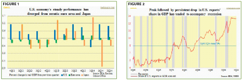
In the Eurozone (comprised of 18 European Union member states), amidst deflationary pressures and an economy that can barely get going, wages are declining. Unemployment, particularly in the South, is persistently high. Risks of a recession are growing. Even in the otherwise-strong North (Germany, etc.), economic activity is in declerating. A lower euro helps, but what truly lacks is resurging end-demand. The EU (28 members) is the biggest economy in the world, and the largest trading partner of the U.S. U.S. exports have been more than holding up, and have diverged from a weakening global macro picture. So far so good. At 13.5 percent of GDP, exports are near all-time highs, having gone sideways since 2011. The U.S. dollar, with a technical breakout, is acting strong and has gone parabolic—up 10 percent since July. A persistently strong currency in all likelihood is not what U.S. exporters would wish for. Looking at Figure 2 (above), we definitely do not want the red line to top out and then weaken. Post-World War II, more often than not, a peak followed by a sustained drop in that line has been accompanied by a recession. Be that as it may, this is something to keep on the radar screen, not to get panicky about right away.
For now, the U.S. economy, to use the oft-repeated metaphor, has proven to be a good house in a bad neighborhood. Yet, there is no question the recovery post-financial crisis has been sub-par. Since 2Q09, real GDP has grown at an annualized 2.2 percent. The recovery has diverged from historical trends. Going all the way back to 1947, growth has averaged 3.3 percent. During the Great Recession, the economy lost nearly nine million jobs. Non-farm payroll peaked in January 2008 at 138.4 million, which was not surpassed until May 2014. Nearly five years of the recovery were spent in regaining the jobs lost during the contraction. As of October, non-farm payroll stood at 139.7 million, 1.3 million above the 2008 peak. North of 92 million Americans (16 years and over) are not in the labor force, versus 78 million at the beginning of 2008; the labor force participation rate continues to shrink (though it has bounced a bit lately). Stagnant wages should not come as a surprise. Nominal hourly earnings (private production and non-supervisory employees) have been growing in the two percent range—in other words, essentially flat after inflation and another example of divergence from the past. As shown on the next page (Figure 3), going back 25 years, wage growth has been much stronger in past recoveries. On a real basis, hourly earnings have been flat as a pancake in the past six years.

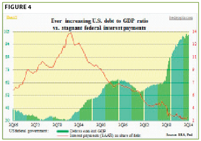
Perhaps most importantly—and maybe even most ominously—it is increasingly taking more government debt to produce a given amount of output. U.S. federal debt-to-GDP ratio has skyrocketed. Both the numerator and denominator are to blame here. As stated earlier, GDP growth has been sub-par in the current recovery. Since 2Q09, nominal GDP cumulatively grew 22 percent. The federal debt during the period surged 55 percent. Sure, we can explain this away saying the country was in the midst of the worst contraction outside of the Great Depression. Since 2008 (calendar year), the cumulative federal budget deficit has totaled over $9 trillion. The trend is getting better, though, with the yearly deficit having improved to below $500 billion in the latest fiscal year. But it is still a yawning deficit. The economy is in recovery mode. Now we can always debate as to if all—or at least a good portion of—that money would have been better utilized in infrastructure investing. But that is a topic of another discussion. A look at the red line (Figure 4) is rather revealing. Even though government debt has gone parabolic, federal interest payments have diverged. Interest payments as a percent of debt are near all-time lows, thanks to the Fed and its policy of suppressed interest rates. One can only imagine how this will look when rates begin to rise, whenever that is.
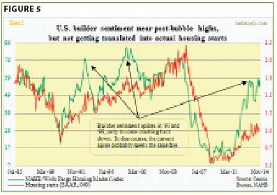
Speaking of interest rates, housing’s role in the U.S. economy cannot be stressed enough. From 1929 through 2013, residential fixed investment averaged 4.2 percent of nominal GDP. In 2004-2006, this shot up to 6.1 percent, 6.5 percent and 6.0 percent, respectively, which is what led to the epic bubble and the crash that followed. In 3Q14, this number stood at 3.2 percent, which is below the 84-year average but higher than the post-crash low of 2.4 percent in 3Q10. Now, no sane person would want to go back to those crazy bubble years. Nonetheless, given where mortgage rates are, one would hope sales would be a bit better. This year, the three-month moving average of new-home sales is essentially flat at 455,000 (as of October at a seasonally adjusted annual rate). New homes comprise a small portion of U.S. sales, but they have a larger multiplier effect vs. existing homes as they spur purchases of durable goods. Besides income and interest rate, price is another key component that goes into deciding housing affordability. The median price of a new home made a low of $204,200 in October 2010. Last month, this came in at $305,000—up 49 percent. So low rates alone do not help. Homeownership dropped to 64.4 percent in 3Q14—the lowest since the first quarter of 1995. But you don’t get that looking at builder sentiment. The NAHB/Wells Fargo housing market index stands near post-bubble high—another divergence. Given demand dynamics, builders in all probability will have to pull in their optimistic horns (Figure 5).
Why? The other variable in the housing affordability equation, income, has barely moved. As stated earlier, nominal wages are hardly keeping up with inflation, even as home prices have firmed up quite a bit. Could income rise at a faster trajectory anytime soon? It is possible, but is it probable? Nope. A shrinking workforce has played a major role in driving the unemployment rate down. Corporations have the luxury to wait before they open up the purse, which is exactly what they have done. Look at Figure 6. It tallies compensation of employees with corporate profits (before tax). As a percent of national income, the latter made an all-time high of 14.6 percent in 3Q13, even as labor’s share made a 60-year-plus low of 60.6 percent (14 percent and 61.4 percent, respectively, as of 2Q14). As early as 4Q08, labor’s share was 66.2 percent. Some drop in less than six years! Here is the irony: Pre-Great Recession, corporate profits peaked at $1.69 trillion in 3Q06, made a low of $1.02 trillion in 4Q08 before more than doubling to $2.15 trillion in 3Q14. So it is not a lack of funds that has led to stagnant wages. It is that the labor market remains a buyer’s market at present. Corporations have been ramping up spending all right—but it’s not been on compensation. Instead, they’ve been splurging on buybacks, dividends, and takeovers.
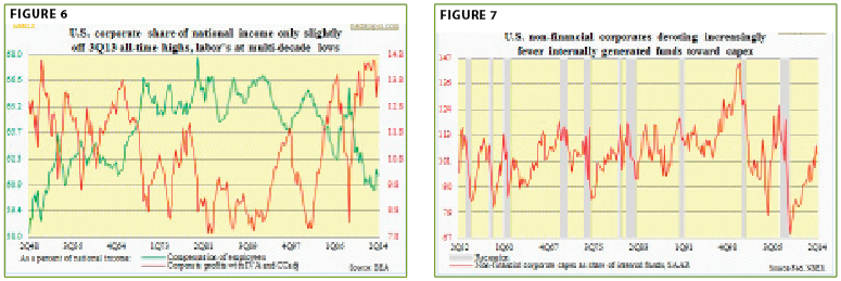
Even capital spending (Figure 7 above) has taken a back seat to share repurchases and dividend payments. Buybacks have fueled one of the strongest rallies in U.S. stock market history. S&P estimates that S&P 500 companies this year are set to spend $565 billion on share repurchases and pay out $349 billion in dividends. Here is the kicker: Combined, they will make up 95 percent of profits, expected to come in at $964 billion. Financial engineering is in full force, and is a primary reason behind maybe the greatest divergence of all—a tentative economy versus a soaring stock market.
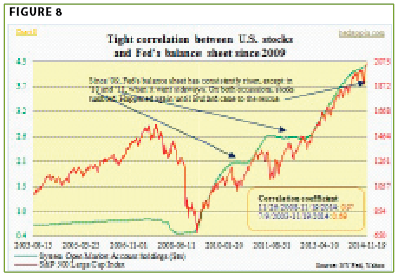
An equally potent force has been central-bank activism. Here at home, when the Fed launched quantitative easing back in November 2008, its balance sheet was under $500 billion. Now it stands at north of $4.2 trillion. That’s right, just under $4 trillion has been created the past six years. At the start of QE1, the S&P 500 Large Cap Index was under 900. Today it is nearing 2100. No divergence between the two. In fact, the correlation since November 2008 is near perfect – .97 (Figure 8). Ben Bernanke, former Fed chairman, believed in the power of rising asset prices. In a November 4, 2010, op-ed in The Washington Post, defending the Fed action, he wrote: "And higher stock prices will boost consumer wealth and help increase confidence, which can also spur spending." Investors heard the message loud and clear, and have responded by venturing further out on the risk curve, primarily via stocks.
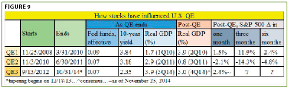
The question du jour on investor minds is this: If stocks responded positively to QE—and they have—now that it has come to an end, what are the repercussions? (Fed assets have continued to grow after October.) Post-financial crisis, there have been three iterations of QE, so we can go back and look at developments the prior two times. It is rather revealing. QE1 ended in March 2010. QE2 did not start until November that year. In between, stocks tumbled. QE2 ended in June 2011, and QE3 did not start until September 2012. Once again, stocks acted like a drug addict begging for a new fix. The economy was doing just fine on both occasions (Figure 9). As QE1 was ending, real GDP grew 1.7 percent in 1Q10, followed by growth of 3.9 percent in 2Q and 2.7 percent in 3Q. QE2 was launched in November 2010 anyway. The difference? From the time QE1 ended, stocks dropped 12 percent by the end of June that year. The following year, the pattern repeats itself. Real GDP did decelerate to 0.8 percent growth in 3Q11 but picked back up to 4.6 percent in 4Q. Until QE3 was launched in September 2012, GDP growth was 2.3 percent in 1Q12 and 1.6 percent in 2Q12 (and 2.5 percent in 3Q12). Once again, in the wake of the end of QE2, stocks took a hit—down 14 percent by September 2011. That is probably what moved the Fed.
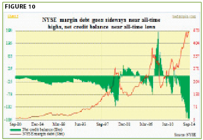
This time the economy is also hanging in there—not going gangbusters, but not falling apart either. Yet, leading up to what looked like a near-certain end to QE3 come October, stocks began to act jittery. Between September 19th and October 15th, the S&P 500 index quickly shed a tad under 10 percent. Nearly every technical indicator I track was in gross oversold territory by then. Price action on October 15th was signaling a reversal could occur. The catalyst came on October 16th when James Bullard, St. Louis Fed president, appeared on Bloomberg TV and said the Fed should consider delay in ending QE, hinting QE4 was possible. Stocks reversed, followed by a V-move! From the lows, the S&P 500 index is up nearly 14 percent intra-day in 31 sessions (as of Wednesday)! For the bulls, the Bullard incident was one more reminder that the Fed has their back. Mr. Bernanke believed in the wealth effect. Ms. Janet Yellen is probably no different. The question is, what might be the pain threshold before the Fed acts again—stocks down 10 percent, 15 percent, or higher? Investors are aware of the "Fed put"—its perceived willingness and ability to prevent serious market declines—and have responded by taking on leverage. In today’s algo- (i.e. formula-based trading) and dark pool-dominated markets, NYSE margin debt is probably not as good a signal as in the past, but it does offer a window into prevailing sentiment (Figure 10). It is near all-time highs, well past 2000 and 2007 peaks. We know how it all ended back then.
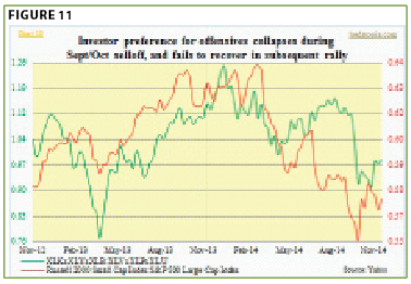
Bulls argue, it is different this time. Despite weakness pretty much across the rest of the globe, the U.S. economy is doing just fine, and firming up (if we were to believe forecasts for next year—both for S&P 500 profits and GDP). P/E valuations are not at nose-bleed territory. Corporate profits are strong. And by selling, where else would you put your money? All valid points. But here’s the rub: Increasingly, there are now signs that investors are beginning to lean defensive—not what one would normally see if they thought things were all hunky-dory. Small-caps have been diverging from large-caps ever since the former peaked in March, and most recently since late October (Figure 11). This is particularly interesting given the strength in the dollar, which can hurt exporters. For the most part, small businesses are domestically oriented. Back in October 2008, U.S. banks’ commercial & industrial (C&I) loans peaked at $1.59 trillion, dropping all the way to $1.18 trillion two years later. From that low, C&I loans have grown 47 percent to $1.74 trillion. This is nothing to sneeze at, but nothing to write home about either. Small businesses rely on banks for funds, as they are not large enough to tap into the bond market. Also, when risk-on sentiment prevails, money flows into offensive sectors, and vice versa. In Figure 11 below, a product of technology (XLK), consumer discretionary (XLY) and materials (XLB) has been divided into a product of healthcare (XLV), consumer staples (XLP) and utilities (XLU). A rising ratio means risk-on is in vogue. Currently, it is not.
There is a similar message coming out of the credit market. Stocks and bond yields have diverged for over two years now. In normal times, they tend to move in sync. Stocks rise as economic prospects improve. Money parked in bonds tend to leave and into stocks, putting upward pressure on yields. We know that QE was putting upward pressure on bond prices. Nonetheless, notice the small circle in Figure 12. That was about the time tapering began late last year. In theory at least, that should have begun to put upward pressure on yields, since a large buyer was now buying less. The opposite has happened. There is tremendous demand for long bonds, and that should not be happening if investors expected "escape-velocity" growth, and inflation. Similarly, if stocks are rallying solely on the back of corporate health, then junk bonds should be riding on their coattails. As stocks began to come under pressure toward the middle of September, junk bonds followed suit. The former troughed in mid-October, and the latter also rallied for a brief period and then diverged. U.S. corporations are on track to issue $300-billion-plus in high-yield bonds—the third consecutive $300-billion-plus year. High-yield and leveraged-loan funds have attracted loads of money from investors in search of higher yields. Flows are beginning to drop.
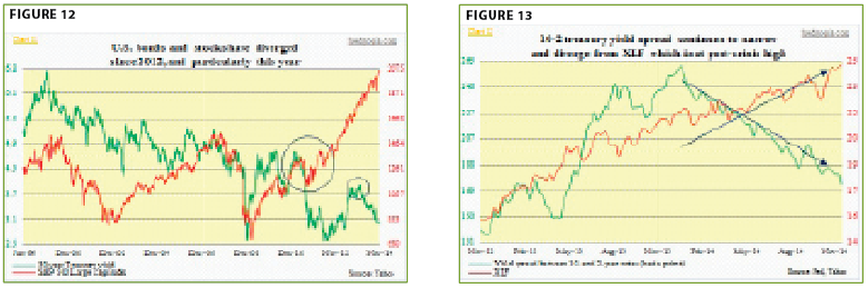
Banks prefer a steep yield curve. They borrow short and lend long. The spread between 10- and two-year notes peaked early this year. Particularly since April this year, financials have diverged from the 10-2 spread (Figure 13 above). These are just a few examples of several other divergences out there. The advance-decline line, particularly on the Nasdaq Composite, is horrible. The index sits a mere seven percent below the 2000 all-time high, but it is the big-caps that are driving it. Participation is not broad. Commodities have diverged from stocks. The point is, stocks are in the midst of a vicious rally, but not everything is in sync. Something is missing. True, when it is all said and done, price trumps everything. But this has also come at a time of extraordinary Fed liquidity. And that is now gone. Yes, as soon as the Fed ended its QE, the Bank of Japan doubled down on its binge-printing. The European Central Bank is hinting of additional stimulus, and the People’s Bank of China just cut interest rates. Central-bank activism is alive and well. And it is hard to fight against that. But there is always a point at which these policies cease to produce the desired response from investors. We should dread that moment. Is it tomorrow or two years from now? Who knows?
In investing there is always a risk-reward tradeoff. From that perspective, this is not the best time to commit intermediate- to long-term capital to U.S. stocks. It is anyone’s guess as to what will transpire between now and the yearend. Seasonally, year-end tends to be good and underperforming managers usually chase the closing surge, pushing stocks up even further. Deep down, though, one day it feels like indices are breaking out, and the next day it feels like they are hanging by a thread. This is a nervous market—and way overbought—setting up for a sharp drop at some point, an outcome for which the majority of investors appear very ill-prepared.
Important Disclosures
This report is for informational purposes only and does not constitute a solicitation or an offer to buy or sell any securities mentioned herein. This material has been prepared or is distributed solely for informational purposes only and is not a solicitation or an offer to buy any security or instrument or to participate in any trading strategy. All of the recommendations and assumptions included in this presentation are based upon current market conditions as of the date of this presentation and are subject to change. Past performance is no guarantee of future results. All investments involve risk including the loss of principal. All material presented is compiled from sources believed to be reliable, but accuracy cannot be guaranteed. Information contained in this report has been obtained from sources believed to be reliable, Evergreen Capital Management LLC makes no representation as to its accuracy or completeness, except with respect to the Disclosure Section of the report. Any opinions expressed herein reflect our judgment as of the date of the materials and are subject to change without notice. The securities discussed in this report may not be suitable for all investors and are not intended as recommendations of particular securities, financial instruments or strategies to particular clients. Investors must make their own investment decisions based on their financial situations and investment objectives.