
“The inherent vice of capitalism is the unequal sharing of blessings; the inherent virtue of socialism is the equal sharing of miseries.”
-WINSTON CHURCHILL
It’s no secret that here at Evergreen we’re boisterous free-market advocates. Data and history show that economies operating freely in a system with moderate and rational government control perform better in the long-run. When economies are burdened by excessive government policy or overwhelmed with authoritarian control, nations become unstable, which often spurs abuse and extremism.
Perhaps no better modern case study of this is Venezuela, a once-proud South American country sitting on the world’s largest oil reserves. Unfortunately for the oil-rich country, years of declining crude prices and authoritarian rule have led it straight into the teeth of one of the most devastating humanitarian crises in history. Recently, matters have gotten much worse, culminating in an opposition-led assassination attempt on president Nicolas Maduro’s life. And there are no signs of hope for a near-term turnaround.
Roughly 2.3 million Venezuelans have already fled their imploding country to neighboring sanctuaries, mostly due to lack of access to food and medicine. Another 1.3 million Venezuelans are currently suffering from malnourishment and the International Monetary Fund (IMF) recently forecast that inflation could reach a jaw-dropping 1,000,000% by year’s-end.
While this month’s Guest EVA comes in the midst of a downward spiral that would make a maelstrom jealous – and might seem like an unfair kick-in-the-gut to the anti-capitalist camp – the underlying assertion that free markets perform better over time than state-run economies is factual based on years of economic data. This week’s author, Daniel J. Mitchell, makes this case by comparing two South American countries that were on similar paths prior to a fork that led Venezuela towards statism and Chile towards capitalism (courtesy of Milton Friedman and his other soulmates at the Chicago School of Economics).
One particularly interesting point of emphasis that Dr. Mitchell highlights is Venezuela’s pivot towards protectionism in the late-1970s, while Chile drastically reduced trade barriers. The trade policy turned out to be a key factor in Chile’s growth and Venezuela’s eventual demise. Let’s hope that the current trade drama doesn’t turn out as poorly – literally – for all nations involved.
* Note: Daniel J. Mitchell holds a Ph. D. in economics from George Mason University and has worked at the Heritage Foundation and Cato Institute. Originally published at International Liberty.

Michael Johnston
Marketing & Communications Manager
To contact Michael, email:
mjohnston@evergreengavekal.com
CAPITALISM: WHY CHILE IS SO MUCH RICHER THAN VENEZUELA
By Daniel J. Mitchell
I’m in China this week, giving various lectures at Northeastern University in Shenyang. My topic today was “Real-World Examples,” which gave me an opportunity to share many of the charts I’ve developed showing how market-oriented nations enjoy much more long-run success.
One of the charts (below) shows how Chile has enjoyed strong growth since it shifted to free markets, especially compared to Venezuela, which is burdened by a vicious form of statism.
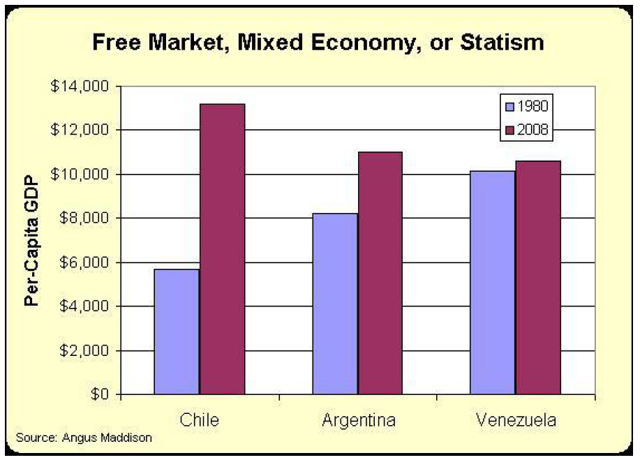
But I noticed that I created that chart back in 2011 and it only shows data for the years between 1980 and 2008. And I thought that might lead students to think I was deliberately omitting recent years because the data somehow contradicts my message about free markets and small government.
So, it’s time for me to update my comparison of Chile and Venezuela. And I’m going to have lots of evidence to share because the World Bank published a lengthy report on Puzzles of Economic Growth just a couple of years ago. And chapter 7 specifically compares the two countries we’re examining today.
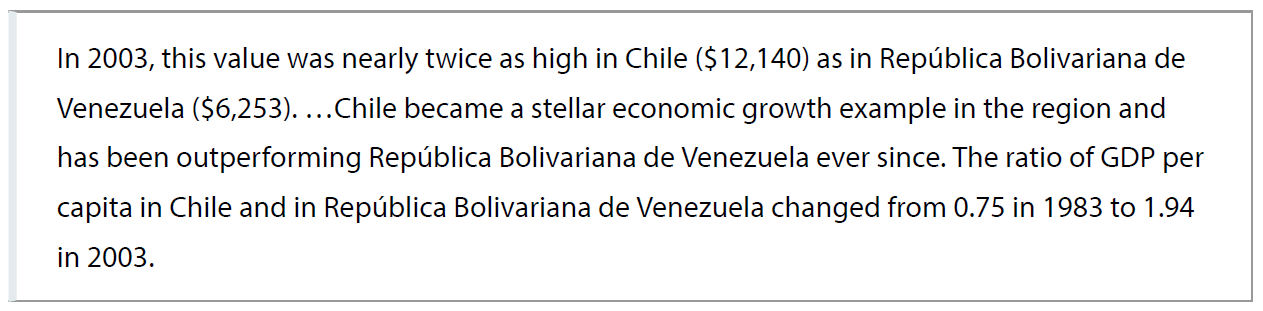
“Chile and República Bolivariana de Venezuela are South American countries of similar size and population. They...share a similar history, cultural heritage and comparable social structures. In 1971, they recorded a similar level of per capita income, that is, $6,603 (chained dollars with a base year of 2001) in Chile and $7,231 in República Bolivariana de Venezuela.”
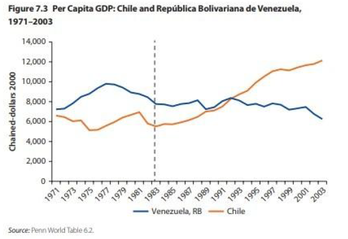
The report explains how neither country enjoyed much success in the 1970s, though oil-rich Venezuela at least benefited from rising energy prices. What’s most relevant, at least for today’s discussion, is how Chile then jumped over Venezuela thanks to pro-market reforms.
Here’s a chart from the report, showing how Chile’s economy grew rapidly while Venezuela languished:
The report is filled with lots of data.
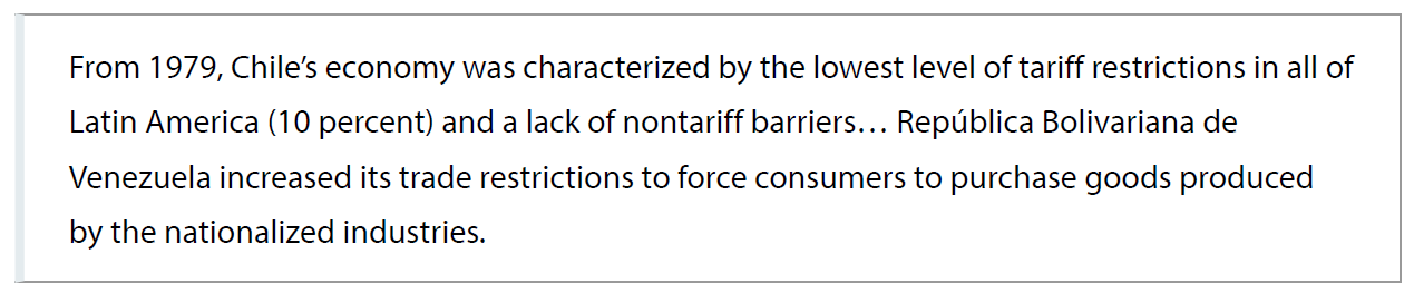
One item that caught my attention, is how Chile dramatically reduced trade barriers while Venezuela was more protectionist.
But Chile’s success goes well beyond trade policy.
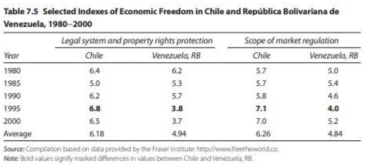
Here’s a table looking at quality of governance and red tape.
And here’s some data looking at obstacles to entrepreneurship. As you can see, it took almost four times longer to open a business in Venezuela in 1999.
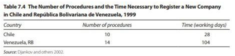
I assume the numbers are even worse today (assuming, of course, that anyone even wanted to open a business in that sad country.
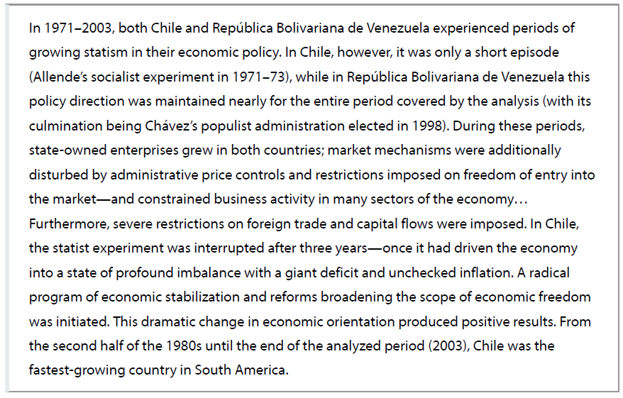
Here are some excerpts from the conclusion of the World Bank report. This is a pretty good summary of how Chile reversed its descent to socialism while Venezuela doubled down on bad policy.
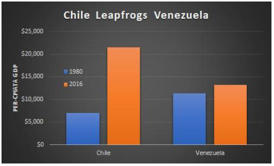
Now it’s time for me to share an updated version of my chart (though I’m removing Argentina so we can focus just on Chile and Venezuela). As you can see, the updated numbers from the Maddison database tell the exact same story as my 2011 chart.
And why has Chile grown so much faster? As I told the students here in China, it’s because there’s more liberty to engage in voluntary exchange.
In the latest report from Economic Freedom of the World, Chile is ranked #15 while Venezuela is at the very bottom.
P.S. Some people have tried to portray Chile as a failure, but such assertions are easily debunked
P.P.S. Kudos to the World Bank for publishing a very substantive report. For what it’s worth, it’s the international bureaucracy most likely to produce sensible publications.
OUR CURRENT LIKES AND DISLIKES
No changes this week.
LIKE
NEUTRAL
* Due to both a massive speculative short position on the 10-year T-note along with sudden weakness in US economic data lately, we are moving to a neutral outlook on longer-term bonds.
DISLIKE
* Credit spreads are the difference between non-government bond interest rates and treasury yields.
** Due to recent weakness, certain BB issues look attractive.
DISCLOSURE: This material has been prepared or is distributed solely for informational purposes only and is not a solicitation or an offer to buy any security or instrument or to participate in any trading strategy. Any opinions, recommendations, and assumptions included in this presentation are based upon current market conditions, reflect our judgment as of the date of this presentation, and are subject to change. Past performance is no guarantee of future results. All investments involve risk including the loss of principal. All material presented is compiled from sources believed to be reliable, but accuracy cannot be guaranteed and Evergreen makes no representation as to its accuracy or completeness. Securities highlighted or discussed in this communication are mentioned for illustrative purposes only and are not a recommendation for these securities. Evergreen actively manages client portfolios and securities discussed in this communication may or may not be held in such portfolios at any given time.